BRANDFOLIA / STUDIO EXAMPLES
Brand Guidelines Examples
Three fictional brands. Recorded AI directions. Real, editable exports. Follow the process or go straight into a sample.
The example records our review choices. It is not an untouched one-click result, a client commission or evidence of business performance.
brand style guide examples
| MORAHome & living | VELASkincare concept | KOROCoffee concept | |
|---|---|---|---|
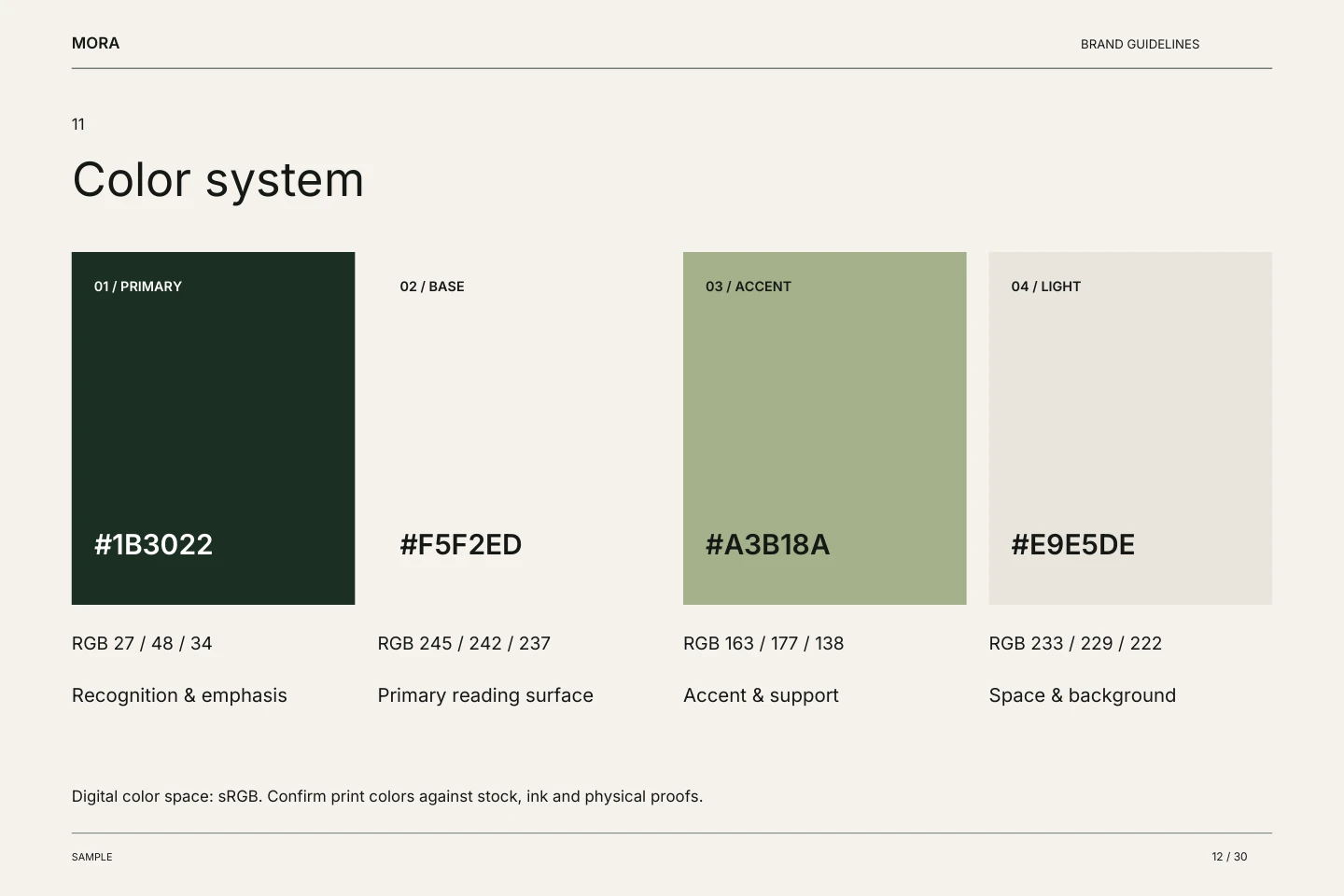
| Color system |
|
|
|
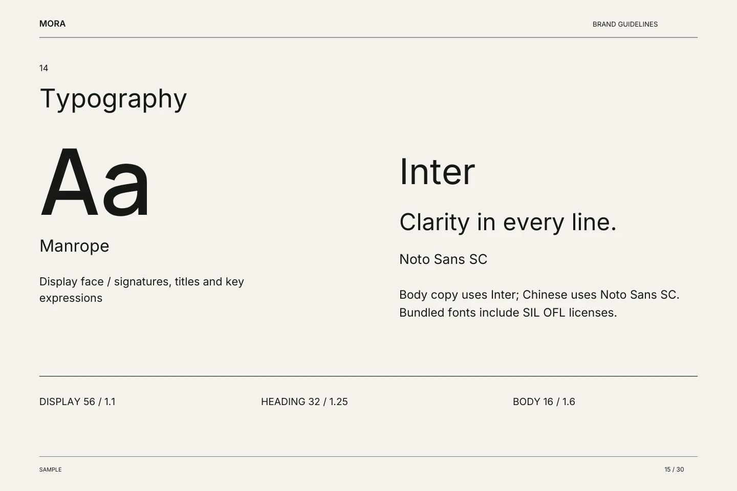
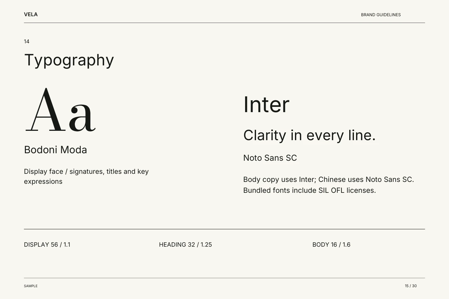
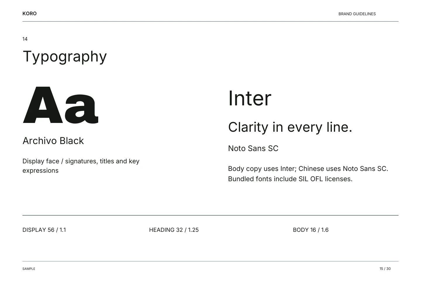
| Typography | ManropeDisplay face / signatures, titles and key expressions Inter / Noto Sans SC | Bodoni ModaDisplay face / signatures, titles and key expressions Inter / Noto Sans SC | Archivo BlackDisplay face / signatures, titles and key expressions Inter / Noto Sans SC |
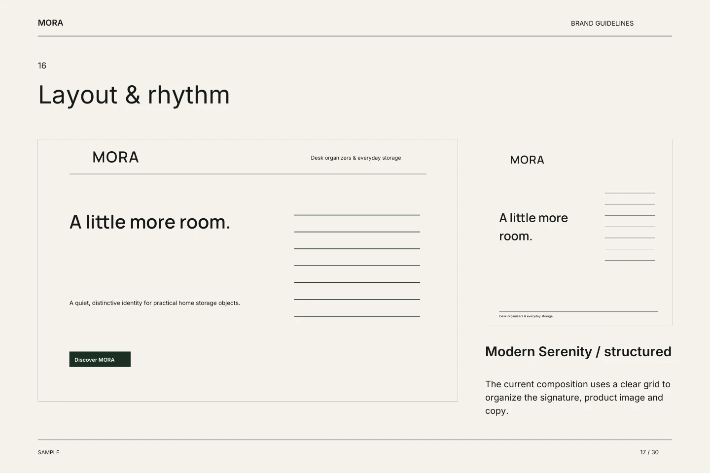
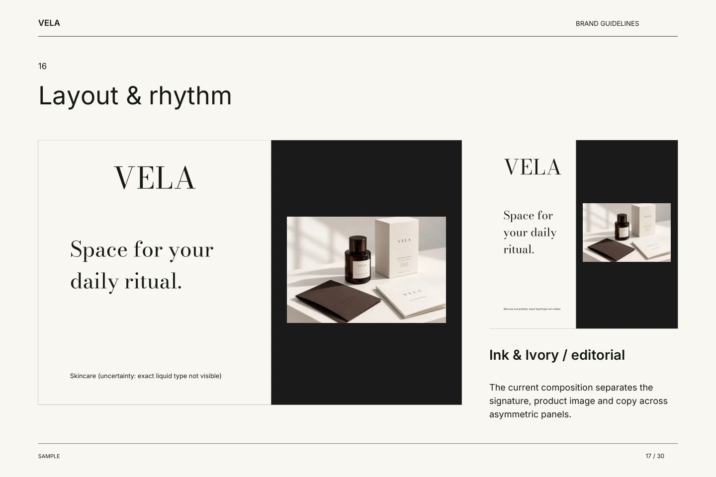
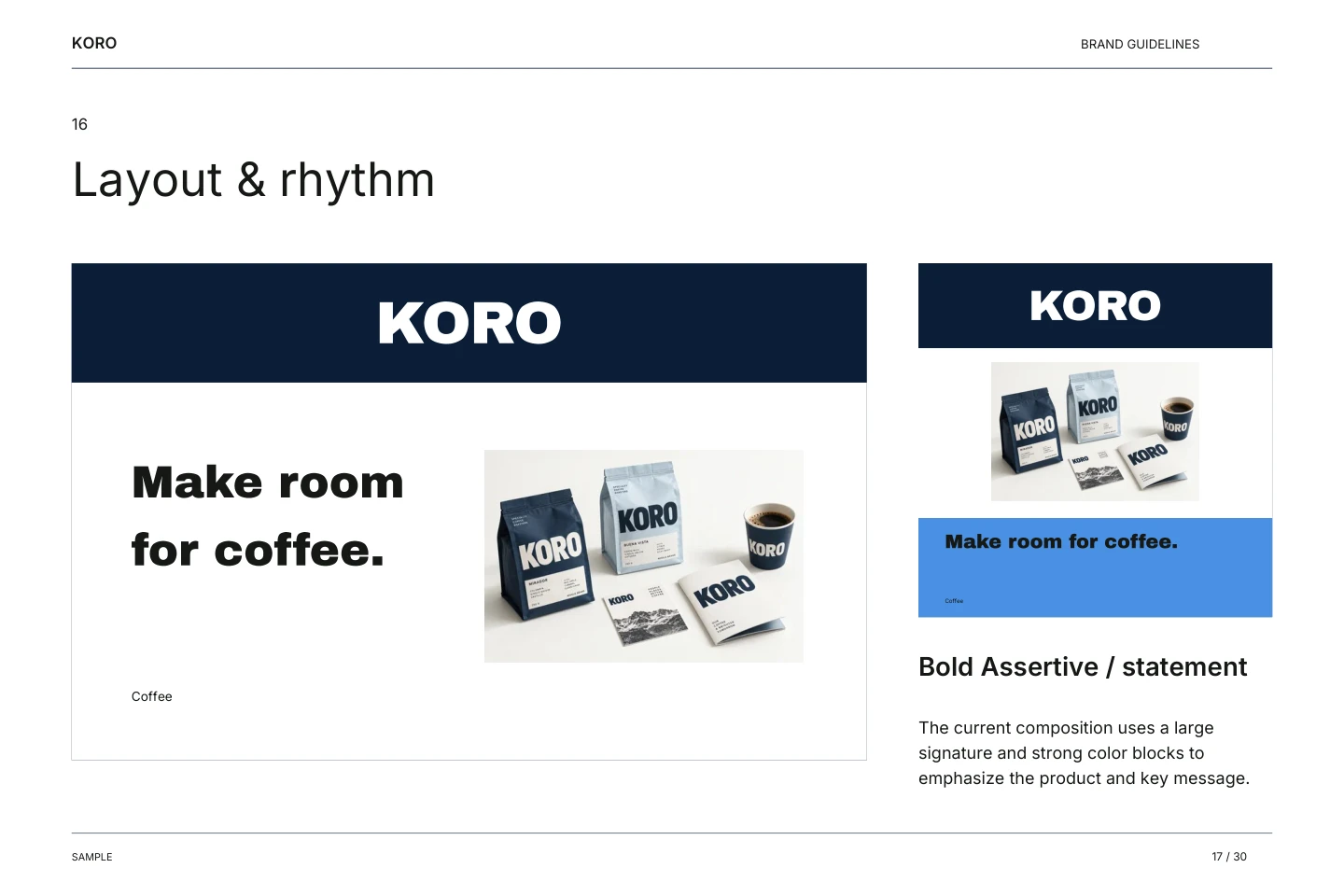
| Layout & rhythm | Modern Serenitystructured | Ink & Ivoryeditorial | Bold Assertivestatement |
| Voice & expression | Calm, practical and clear. Speak about everyday use; avoid unverified material or environmental claims. | Quiet, concise and considered. Describe the visual idea and daily routine without inventing ingredients or benefits. | Direct and inviting. Keep product details factual; do not invent origin, roast, awards or sustainability claims. |
| Download the files | Download brandbook PDF Download source ZIP | Download brandbook PDF Download source ZIP | Download brandbook PDF Download source ZIP |
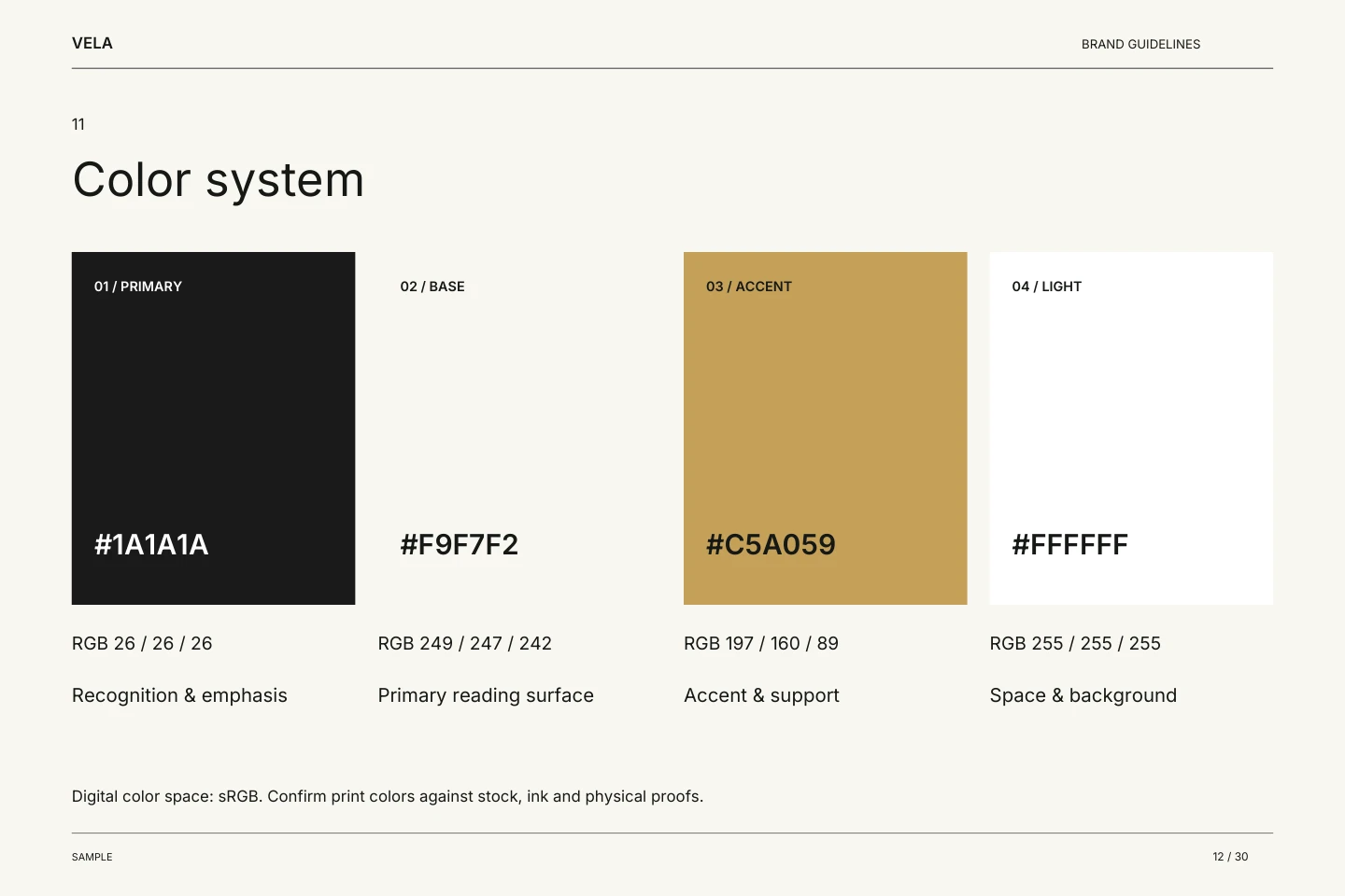
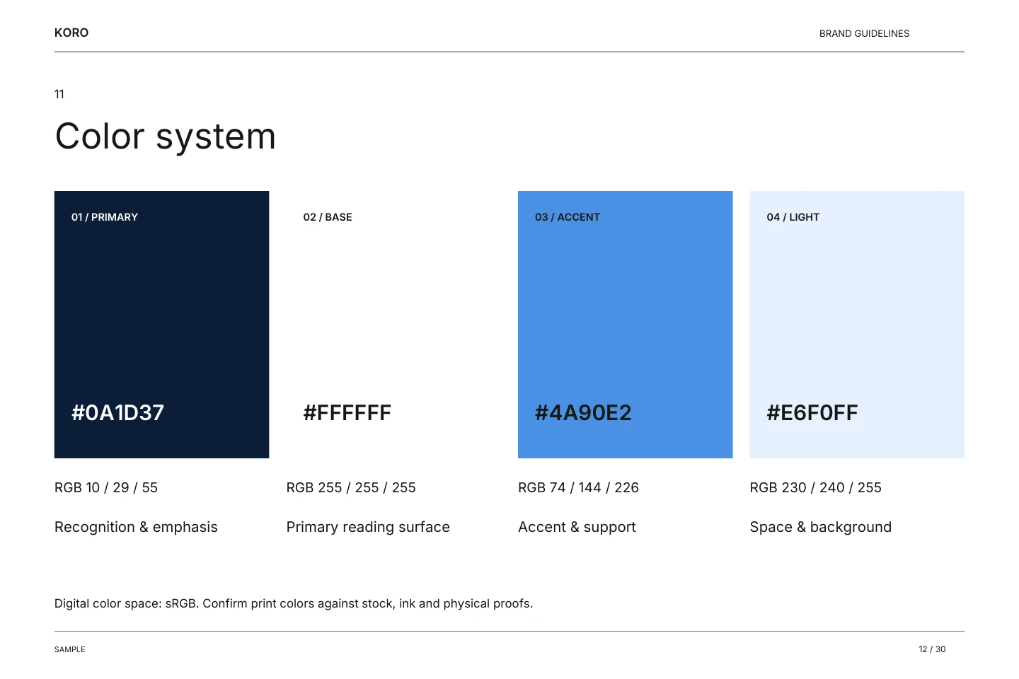
Digital color space: sRGB. Confirm print colors against stock, ink and physical proofs.
Home & living · Studio example
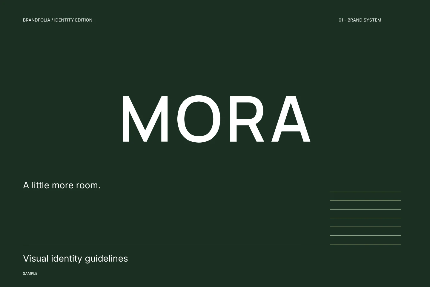
MORA
A little more room.
MORA is a fictional home-storage concept for small spaces. This proposed identity brings together calm colors, clear typography and simple layouts.
Selected direction and refinements
Uses the requested forest green and sage to create a grounded, calm atmosphere. The structured layout reflects the organized nature of the products.
- Selected the modern direction from the three recorded proposals.
- Refined the tagline to “A little more room.” and rewrote the story and voice as a fictional concept, removing unsupported product or business claims.
- Left contact details blank. The final palette, type and composition use the selected AI direction.
- Replaced the uncertain category text with “Desk organizers & everyday storage”, using the products already named in the fictional brief. This was a manual clarification; the recorded AI analysis is preserved.
The example records our review choices. It is not an untouched one-click result, a client commission or evidence of business performance.
Skincare concept · Studio example
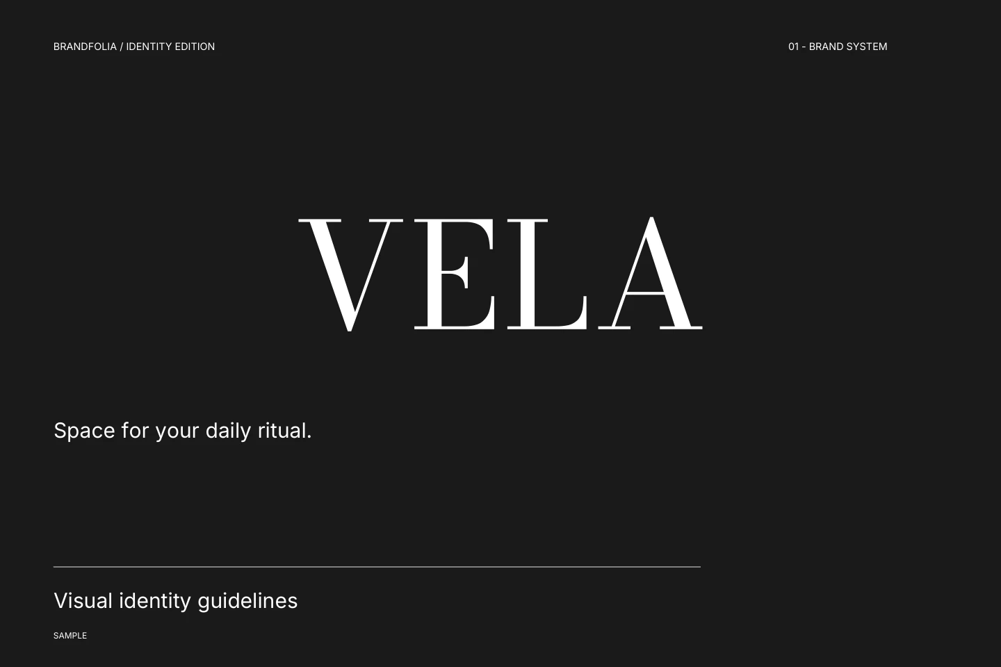
VELA
Space for your daily ritual.
VELA is a fictional skincare concept. Its proposed identity uses an editorial serif, dark ink and warm light surfaces, without making product-performance claims.
Selected direction and refinements
Uses the dark bottle and white box colors to create a high-contrast, sophisticated palette. The serif direction aligns with the user's request for an editorial feel.
- Selected the editorial direction from the three recorded proposals.
- Refined the tagline to “Space for your daily ritual.” and rewrote the story and voice as a fictional concept, removing unsupported product or business claims.
- Left contact details blank. The final palette, type and composition use the selected AI direction.
The example records our review choices. It is not an untouched one-click result, a client commission or evidence of business performance.
Coffee concept · Studio example
KORO
Make room for coffee.
KORO is a fictional coffee concept. Its proposed identity pairs a strong wordmark with blue panels and clear information hierarchy.
Selected direction and refinements
Uses the existing navy and white palette to create high-impact blocks. The heavy typography is mirrored in the layout to command attention.
- Selected the bold direction from the three recorded proposals.
- Refined the tagline to “Make room for coffee.” and rewrote the story and voice as a fictional concept, removing unsupported product or business claims.
- Left contact details blank. The final palette, type and composition use the selected AI direction.
The example records our review choices. It is not an untouched one-click result, a client commission or evidence of business performance.
Download the files
30 PDF pages, 4 signature SVGs, 13 application SVGs and an editable brand profile, with color CSS, fonts and licenses.
SVG text is outlined. Edit wording in the studio or reimport the JSON profile. Photos are included in this sample’s full backup. Packaging and interface artwork are concepts, not production specifications.