VELA
A quieter kind of presence.
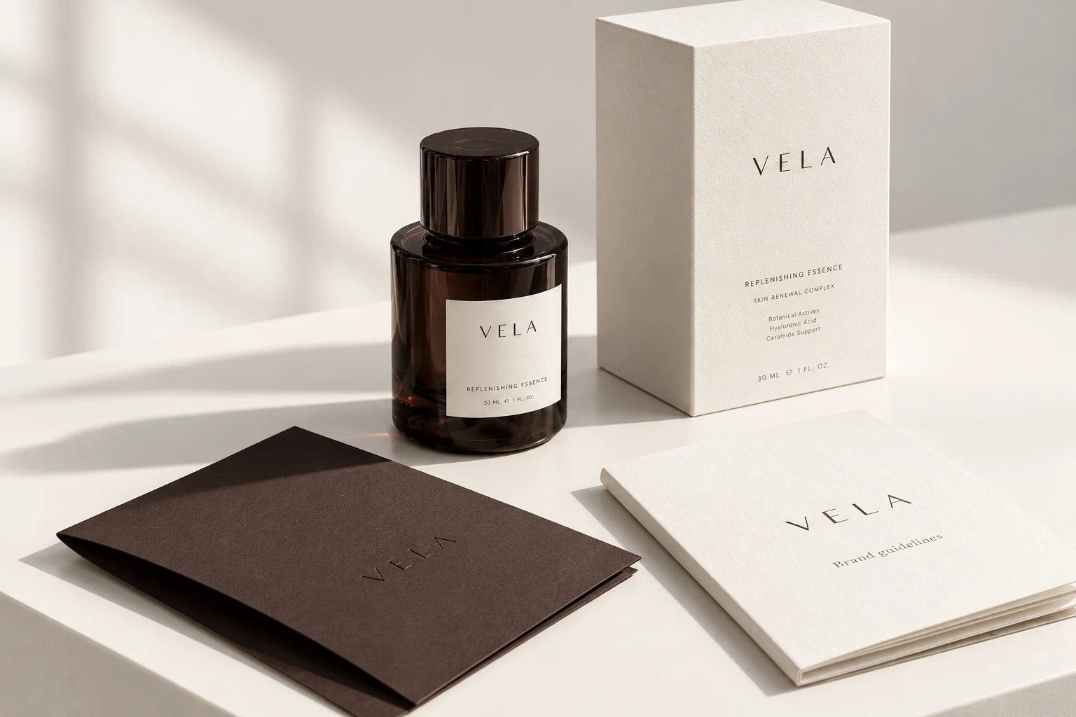
A quieter kind of presence.
A skincare identity built around a simple tension: a tactile, personal ritual expressed through a precise, restrained visual system.
What did this brand need?
Create an intimate, premium visual language that can move from a product label to a digital campaign without becoming decorative.
Why these colors and type?
Espresso supplies the point of recognition. Porcelain paper and a pale stone accent make space around it. A widely spaced wordmark gives the identity a composed character, while supporting type stays direct and functional.
Where does the identity work?
The concept brings together product packaging, a printed guideline book and small-format brand collateral. The same palette can carry into campaign layouts and a digital storefront.
A daily ritual, precisely arranged.
A design-conscious skincare customer who values a clear, uncluttered routine.
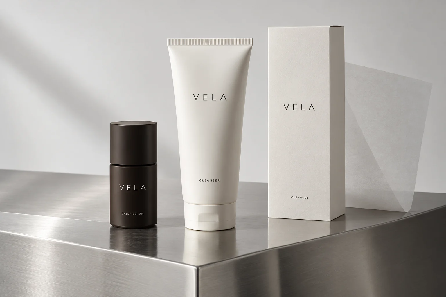
A serum bottle establishes recognition. The cleanser tube carries the same typographic hierarchy onto a taller, softer format. The carton connects both with a consistent label field.
- Keep the wordmark in the upper part of the label and product information below.
- Use dark lettering on porcelain for supporting copy. Reserve dark surfaces for the hero bottle.
- Photograph matte packaging with diffuse light; use steel only as a supporting material.
What is inside the finished system?
A complete case handbook: brand foundation, master artwork, clear space, incorrect use, color contrast, type, grids, photography and six editable applications.
Includes native vector logos, editable SVG pages, licensed fonts, source records and a prompt for every chapter.
Fictional case / v2.0. Brand-name clearance, real product labels and print proofs remain pending. The supplied vector master replaces lettering in earlier exploratory images. Separately authored from the studio renderer. See its current output.
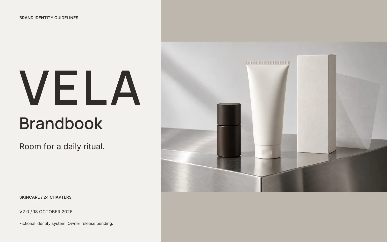
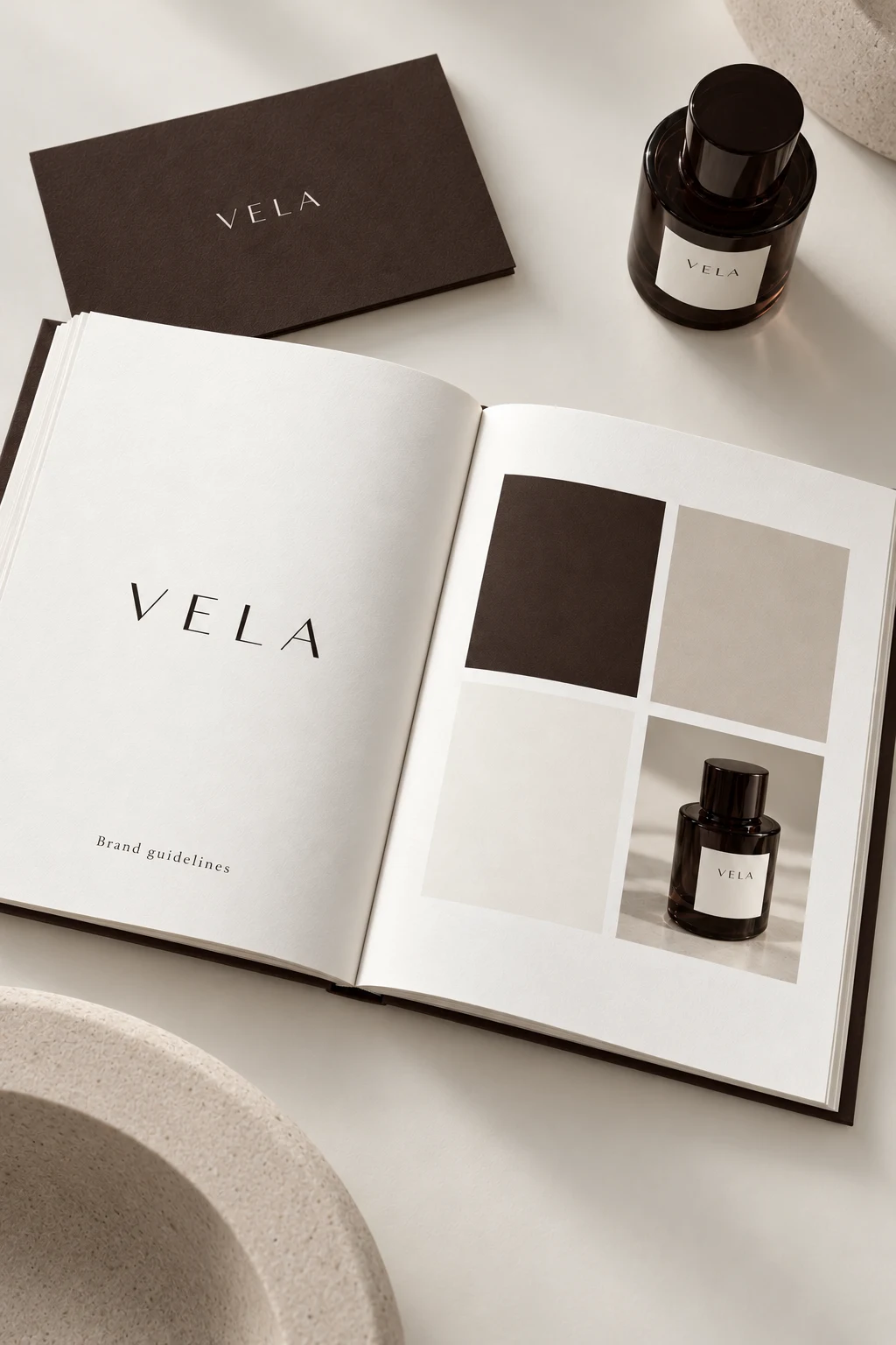
From a product to a visual language.
The bottle, paper and palette repeat the same warm material language. The open spread demonstrates how a wordmark, color references and photography can be presented together without filling every margin.
What to take from the study
When reviewing skincare branding, compare the product label, campaign and handbook. Check whether the same hierarchy survives at a small label size. A beautiful mockup does not replace required label information or production proofs.
Skincare branding · Brandbook layout · Espresso palette
Explore this color paletteSee the actual editor outputIntimate. Composed. Precise.
Load these colors into your own project. Concept photography is not part of the editable layout preset.
Make the direction your own.
Open the studioThree free watermarked previews. Planned paid packages from $99; not open for orders. Explore planned packages.