KORO
Made to be noticed.
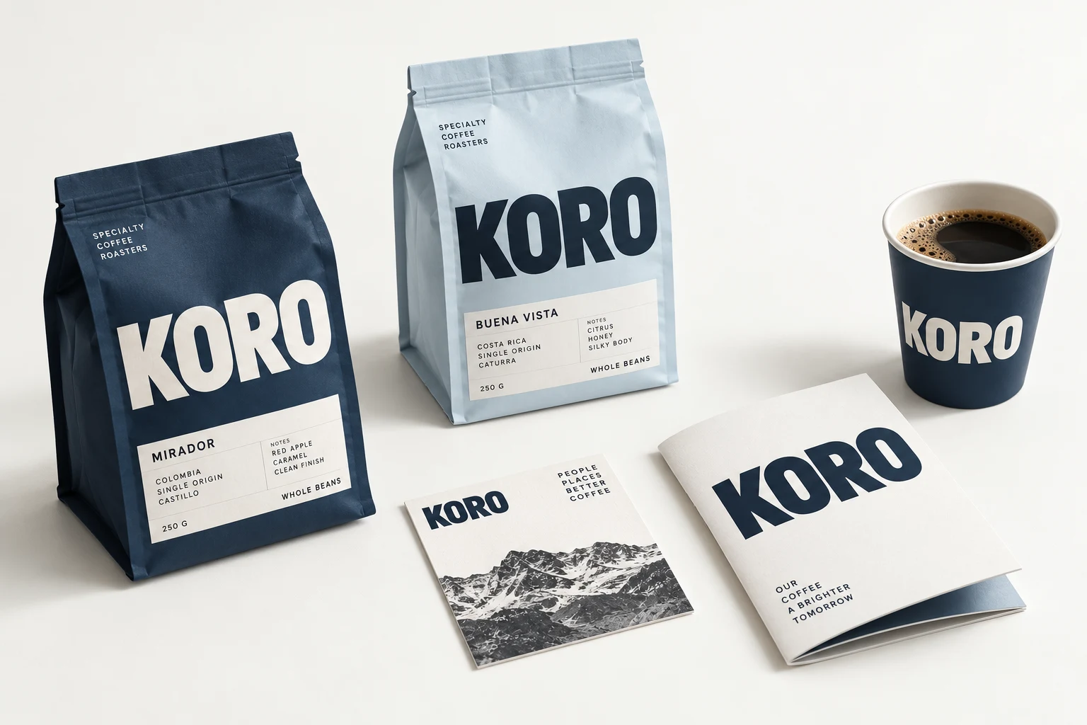
Made to be noticed.
An expressive coffee identity that uses an assertive wordmark, a tightly controlled two-color system and everyday packaging as its main canvas.
What did this brand need?
Give a specialty coffee concept a distinctive shelf presence, with enough simplicity to remain recognizable on cups, pouches and compact social crops.
Why these colors and type?
Midnight navy creates a strong visual anchor. Powder blue adds contrast without multiplying colors. The broad sans-serif wordmark gives each surface a clear reading order.
Where does the identity work?
Pouches, cups, printed cards and a brand manual demonstrate the same identity at different scales. The challenge is consistency in hierarchy, not adding more elements.
Recognition at the first glance.
A specialty-coffee customer moving between the shelf, the cafe and an online store.
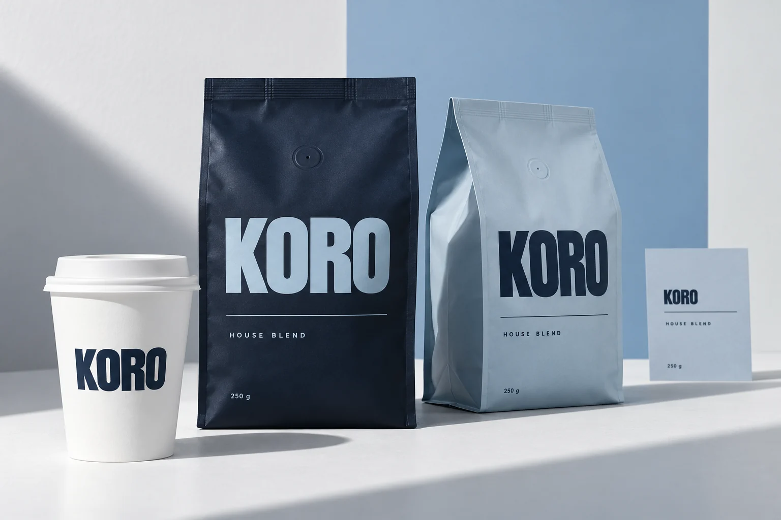
Two contrasting pouches create a recognizable family. A white cup reduces the system to its essentials, while the information card provides room for product detail.
- Keep the wordmark dominant and the product-information block visibly separate.
- Reverse the same two colors across the pouch family rather than adding a new color for every surface.
- Keep cup branding legible at hand-held scale and preserve the packaging silhouette in campaign crops.
What is inside the finished system?
A complete case handbook: brand foundation, master artwork, clear space, incorrect use, color contrast, type, grids, photography and six editable applications.
Includes native vector logos, editable SVG pages, licensed fonts, source records and a prompt for every chapter.
Fictional case / v2.0. Brand-name clearance, real product labels and print proofs remain pending. The supplied vector master replaces lettering in earlier exploratory images. Separately authored from the studio renderer. See its current output.
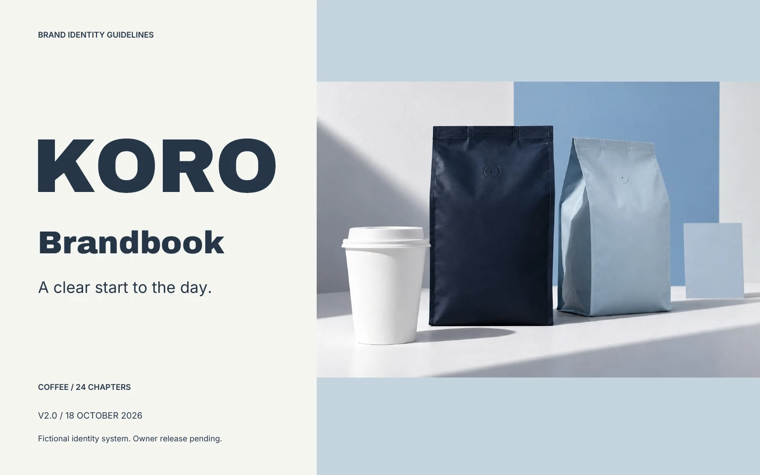
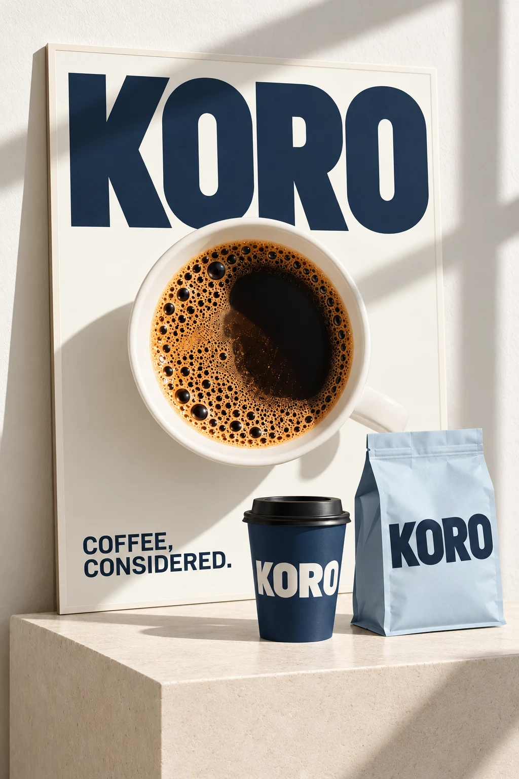
One recognizable voice. Across every format.
A dominant wordmark and navy and powder-blue accents carry the identity from a pouch to a cup and a campaign poster. The poster adds a large product image while keeping the label system visually connected.
What to take from the study
Coffee packaging needs a clear order: brand recognition, product identity and the information needed to choose. Keep the identity consistent while leaving room for different products. This study illustrates direction, not a finished package specification.
Coffee branding · Packaging inspiration · Graphic campaign
Explore this color paletteSee the actual editor outputDirect. Energetic. Uncomplicated.
Load these colors into your own project. Concept photography is not part of the editable layout preset.
Make the direction your own.
Open the studioThree free watermarked previews. Planned paid packages from $99; not open for orders. Explore planned packages.