Color with
a point of view.
Explore four brand color palette examples from our fictional concept studies. Each uses four defined roles: primary, base, secondary and light. Copy a HEX code or load the complete palette into your project.
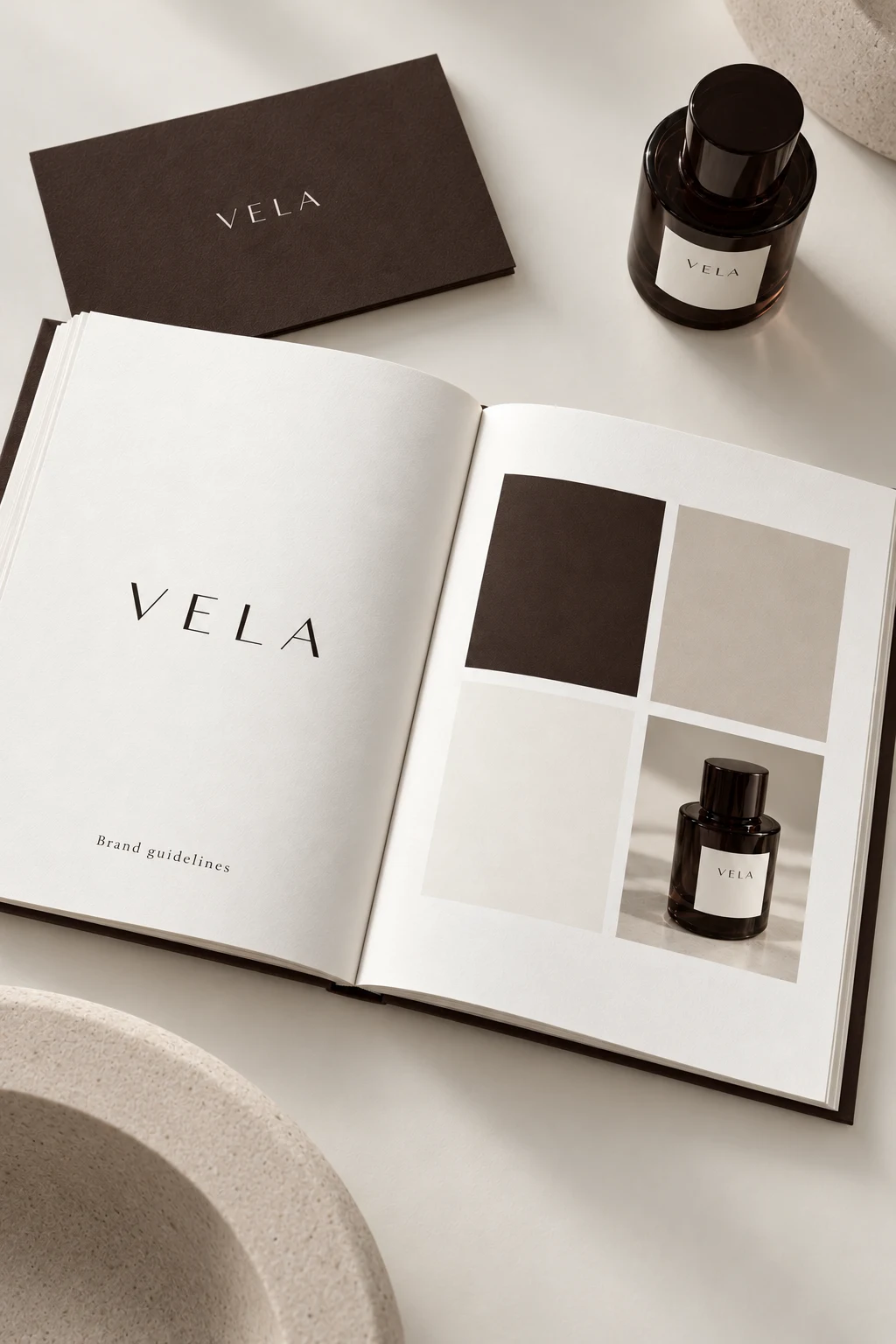
VELA
Espresso supplies the point of recognition. Porcelain paper and a pale stone accent make space around it. A widely spaced wordmark gives the identity a composed character, while supporting type stays direct and functional.
Porcelain 65% · Espresso 25% · Stone 10%
A suggested starting balance for a composition, not a measured photograph or a fixed rule. Keep small text on an approved high-contrast pairing.
Primary / light contrast: 13.40:1. Primary / base: 12.39:1.
Calculated from these sRGB HEX values. These two checks do not certify every color pairing or the contrast of text over photographs.
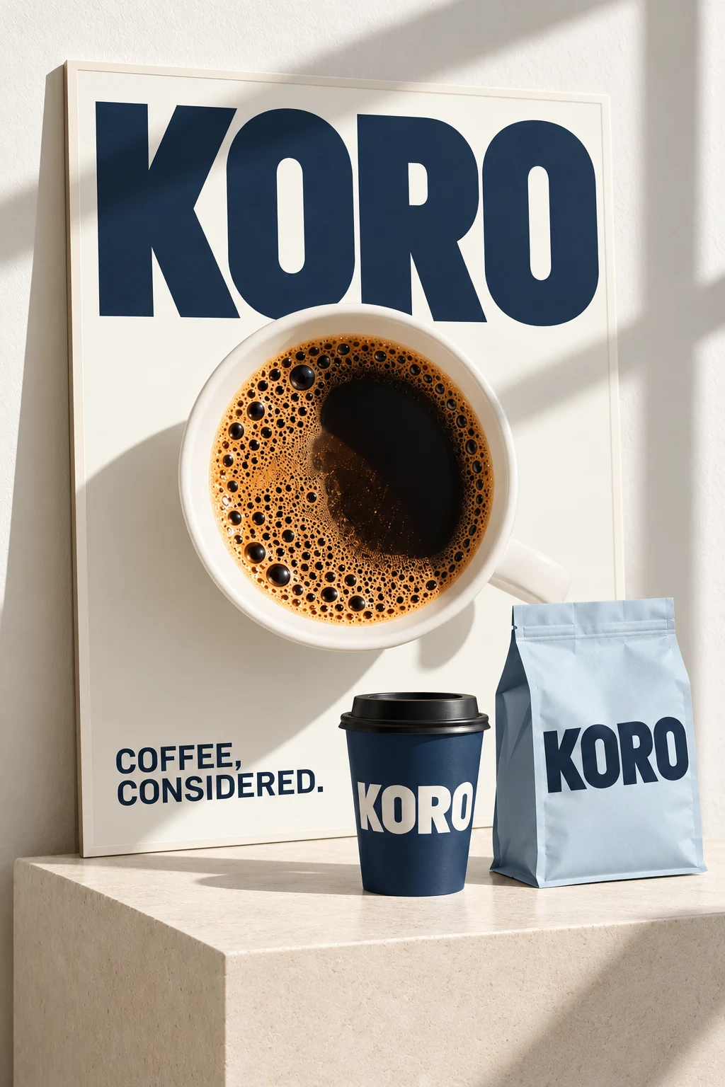
KORO
Midnight navy creates a strong visual anchor. Powder blue adds contrast without multiplying colors. The broad sans-serif wordmark gives each surface a clear reading order.
Porcelain 65% · Midnight 25% · Powder blue 10%
A suggested starting balance for a composition, not a measured photograph or a fixed rule. Keep small text on an approved high-contrast pairing.
Primary / light contrast: 11.79:1. Primary / base: 11.27:1.
Calculated from these sRGB HEX values. These two checks do not certify every color pairing or the contrast of text over photographs.
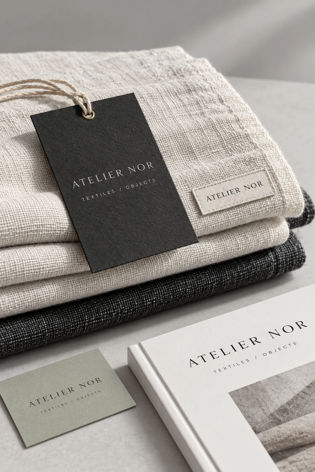
ATELIER NOR
Charcoal gives the neutral materials a consistent anchor. A small sage accent, generous margins and understated labeling leave the product texture in focus.
Chalk 65% · Charcoal 25% · Sage 10%
A suggested starting balance for a composition, not a measured photograph or a fixed rule. Keep small text on an approved high-contrast pairing.
Primary / light contrast: 12.38:1. Primary / base: 11.31:1.
Calculated from these sRGB HEX values. These two checks do not certify every color pairing or the contrast of text over photographs.
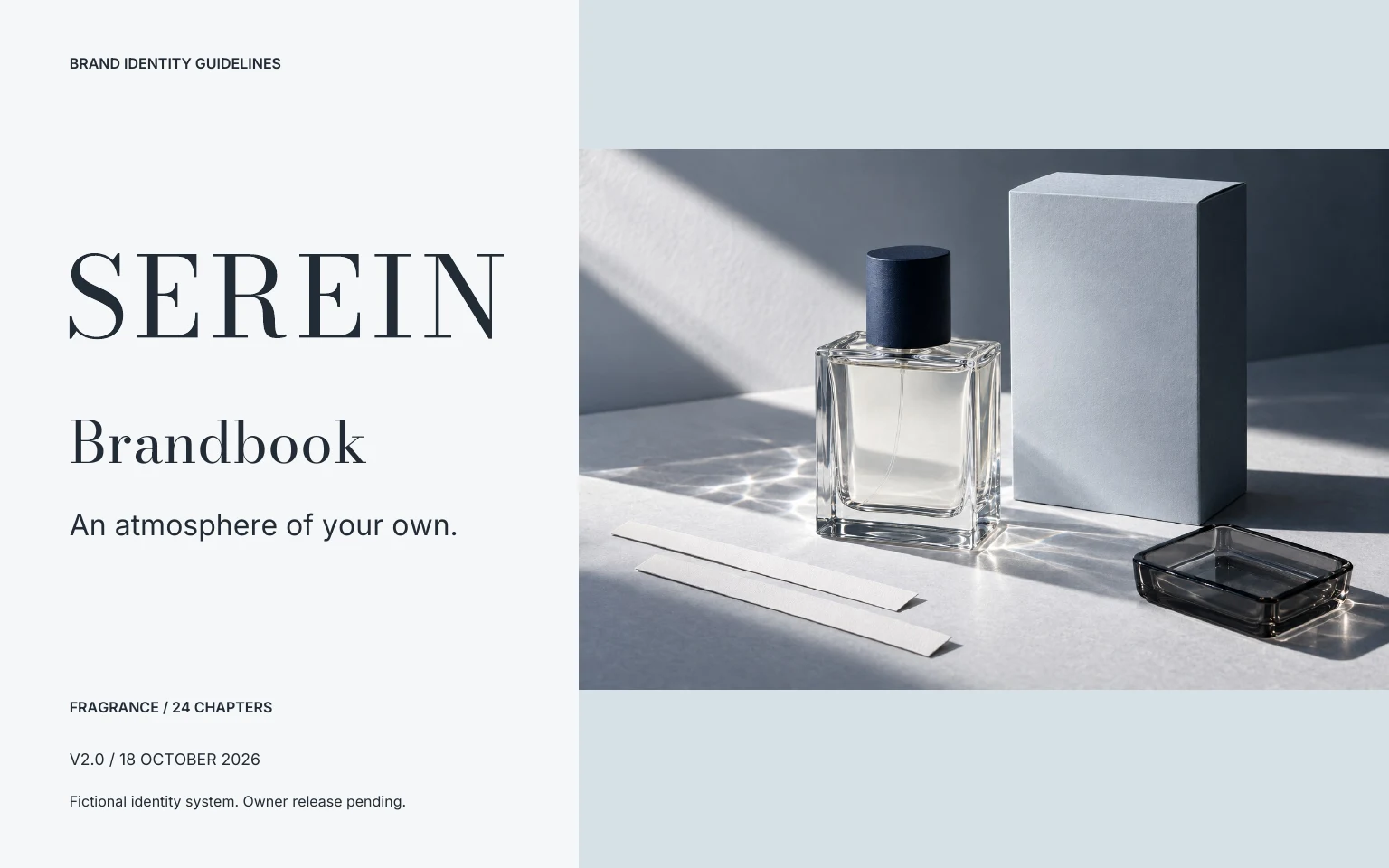
SEREIN
An ink-blue cap anchors the transparent bottle. Cool silver-blue paper provides a reading surface, while the serif wordmark introduces a deliberate contrast to small functional copy.
Cool white 65% · Ink 25% · Silver blue 10%
A suggested starting balance for a composition, not a measured photograph or a fixed rule. Keep small text on an approved high-contrast pairing.
Primary / light contrast: 14.14:1. Primary / base: 13.16:1.
Calculated from these sRGB HEX values. These two checks do not certify every color pairing or the contrast of text over photographs.
Choose roles,
then test applications.
- Use a primary color to establish recognition. Decide where it should dominate and where it should become an accent.
- Choose a base that supports product photography and long reading surfaces.
- Use the secondary color for a defined purpose, such as emphasis or a supporting campaign.
- Check text contrast on the actual surface and at the intended size. Record approved combinations in the handbook.
Printed color depends on the process, paper and proof. These digital HEX values are starting points, not guaranteed CMYK or spot-color matches.
Build the identity around your product.
Create a free previewThree free watermarked previews. Planned paid packages from $99; not open for orders. Explore planned packages.