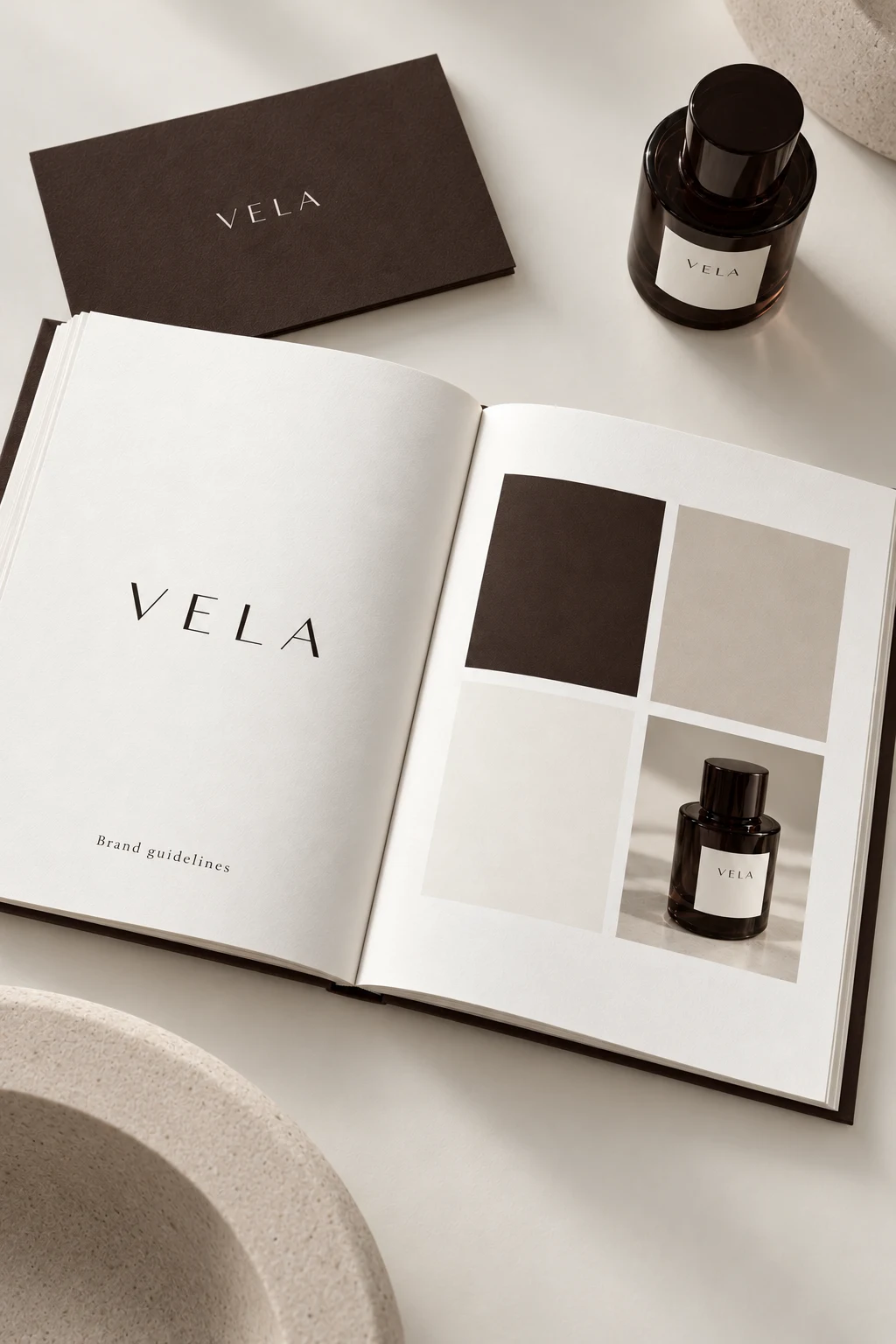
They answer different questions
| Question | Moodboard | Brand guidelines |
|---|---|---|
| What are we deciding? | The feeling, visual territory and possibilities | The approved rules and how to apply them |
| What belongs inside? | Selected references, materials, color ideas and typography directions | Approved assets, color values, type roles, examples and constraints |
| How is it used? | To discuss and choose a direction | To create consistent work after the direction is chosen |
Start with the customer's context
Write a short brief before collecting images. Name the product, audience, buying situation and desired impression. A calm skincare ritual and a lively takeaway coffee moment call for different choices. “Premium” alone is too broad to decide the type, palette or photography.
Download the editable brand brief worksheet to structure the discussion. It is a plain-text worksheet you can open in your own editor; it does not import automatically into the studio.
Choose references for a reason
For each reference, note the decision it helps explain: contrast, composition, scale, texture, spacing or voice. A board of unrelated attractive images can create disagreement because each person sees a different lesson. Keep source links with any third-party reference and treat it as a reference rather than a ready-to-use brand asset.
Translate the direction into rules
Replace “earthy colors” with named color roles and actual values. Replace “elegant typography” with a chosen display face, supporting face and a clear hierarchy. Replace “natural photography” with decisions about lighting, crop, background and the space around the product.
The brand color palette examples show how a broad mood can become four explicit color roles. Compare the same values across backgrounds and applications before declaring them approved.
Test a few real applications
Review a label or package concept, a product page and a social composition together. Check whether the product is recognizable and the text is readable at the actual size. If a rule fails in an important format, adjust the system before producing more assets.
The KORO coffee study shows one graphic direction across packaging and a campaign. The ATELIER NOR textile study asks a different question: how does a quiet identity carry into small labels and textured materials?
Make the handoff explicit
Keep approved files separate from early references. Document which logo version, color pairing, typeface and image treatment should be used, and what still needs review. Include examples that explain the rule rather than simply decorating the document.
Use the 12-section guidelines template to organize the decisions. The current Brandfolia studio supports palette and typography settings, supplied images and logos, six digital applications and a modular PDF. It does not provide a freeform moodboard collage editor or automatically create the concept photography.
What to do next
If you are still choosing a visual direction, start with the identity concept studies and the brief worksheet. If the decisions are ready, follow the brandbook creation walkthrough and inspect the actual sample PDF before exporting your own.