Write the rules people actually need
A short social guide should answer which logo to use, which colors have which roles, how text is set, what imagery is acceptable and how the brand speaks. A palette without usage rules leaves every person to improvise. A long brandbook without a quick reference makes everyday work slow.
Start with an existing one-page brand board, then add the channel decisions that the board cannot express. Keep a link to the current source package so the reference does not become an orphaned screenshot.
Separate fixed decisions from adaptable ones
| Element | Keep stable | Adapt to the task |
|---|---|---|
| Logo | Approved mark and proportions | Choose an approved variant for the actual background |
| Color | Named roles and current values | Adjust how much space each role occupies |
| Typography | Heading and body roles | Reflow text and adjust hierarchy for the format |
| Imagery | Rights, truthful product detail and a defined treatment | Choose a crop that supports this post’s question |
| Voice | A useful tone and prohibited unsupported claims | Write a distinct message for the actual information |
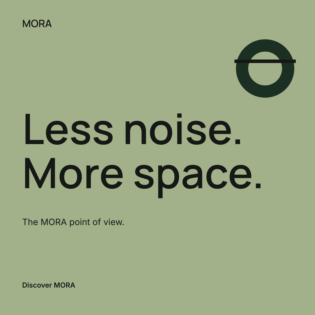
For MORA, the saved palette uses forest green #1B3022, warm base #F5F2ED, sage accent #A3B18A and light neutral #E9E5DE. Those values describe this fictional example. They are not a universal recommendation for a home brand.
Check three common uses
A profile image
Use the simplest recognizable approved mark. Inspect it in the destination’s actual crop. A full wordmark that looks good on a large board may become unreadable in a small circular preview. Do not stretch the mark to fill the frame.
A feed post
Choose one main message, a short supporting line and an accurate destination. Use an original product photograph when the message depends on a physical feature. Keep decorative patterns away from essential text.
A vertical composition
Recompose the design rather than stretching a square. Leave space for the destination platform’s overlays, then inspect its current preview before publication. A fixed safe-area claim can become stale when the platform changes its interface.
Verify contrast and image meaning
Check text and its actual background, including over photographs. The WCAG contrast explanation defines 4.5:1 for normal text and 3:1 for qualifying large text. Passing a color pair does not certify an entire post or guarantee readability at every size.
Use the contrast checker, then inspect the export at its expected viewing size. Write alternative text that explains useful visual information where the platform supports it. The W3C image decision tree helps distinguish informative and decorative imagery.
Keep a revision trail
Store the source revision, artwork, caption and destination together. When the brand changes its accent color or name, regenerate the affected exports; editing a label in a document does not update an image already downloaded. Record which revision was actually published.
Download the brand reuse and review checklist
Continue with the weekly content plan, the brand voice worksheet or the social media kit. Sample editing and export in the Identity Studio are available without an account; the account workspace and AI creation have their own access and plan requirements.