About the example: DAYMARK is an original fictional brief with curated identity settings. The images are actual Brandfolia exports, not customer work, product photography or evidence of a live AI run. The DAYMARK case page records the inputs and design choices.
Define the service without inventing a product
Start with the audience, the problem and the task the software actually supports. A useful brief can be written without a physical product or product photo. Separate an available feature from a planned idea, and keep evidence for claims about integrations, customer numbers or time saved.
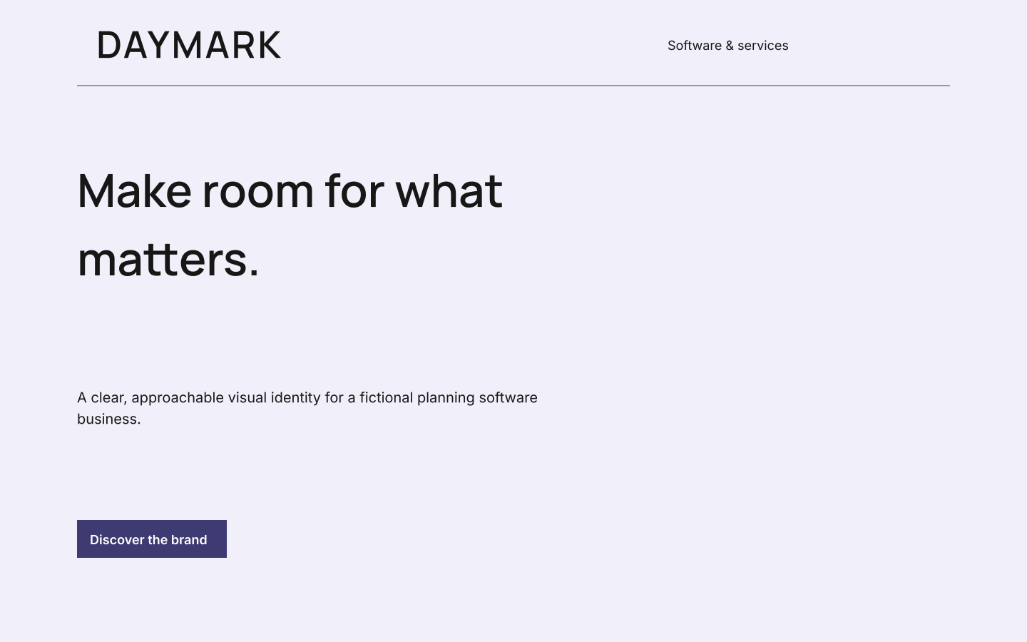
DAYMARK is a fictional planning-software identity for small teams. Its written brief supports a wordmark, a presentation direction and website artwork. It does not establish a functioning planning app or any particular feature. Use its files to explore the identity, then supply your own product facts and implemented screens.
Map brand colors to interface decisions
A palette names the brand colors. An interface also needs decisions about text, surfaces, links, focus, disabled controls and status. Write those roles explicitly rather than applying the accent to every element. DAYMARK’s violet #3E3A72, pale base #F0EFFA and lilac accent #B6A5E2 are starting values to evaluate, not automatic accessibility approval.
| Brand input | Interface decision to make | Evidence to keep |
|---|---|---|
| Primary identity color | Where links and primary actions use it; what happens on hover and focus. | Actual foreground/background pairs and implemented states. |
| Supporting palette | Surface and decorative roles; separate status semantics from decoration. | A screen showing the same role used consistently. |
| Type direction | Heading, body, label and data roles using real text lengths. | Font licenses, implementation sizes and overflow checks. |
| Voice | Labels, empty states, errors and confirmations. | Copy tied to the actual action and recovery route. |
| Graphic style | Marketing illustration versus product screenshots. | Image source and whether the depicted capability exists. |
For ordinary text, WCAG 2.2 criterion 1.4.3 sets a minimum contrast ratio of 4.5:1, with 3:1 for qualifying large text and specified exceptions. Check the actual text/background pair in the contrast checker. Passing that check covers one requirement; it does not establish that the interface meets all accessibility requirements.
Write for the actual state of the product
Use one tone across marketing and the app, but let the task determine how much personality belongs in a message. A collection tagline can be expressive. An error should explain what failed and what the user can do next. A confirmation should describe what actually happened.
For a hypothetical planning product, “Your changes were saved” is appropriate only after saving succeeds. “Try again” needs an action that can retry. Before adding any such example to a real interface, connect it to the implemented behavior. The worksheet asks for trigger, message, action and verification; it does not assume DAYMARK supplies those states.
Set rules for screenshots and demo imagery
Prefer current screenshots for an available feature, with permission to show the data. Remove private customer information from the source or use a suitable test account before capturing. If you show a proposed screen, label it as a concept so the image does not imply that the feature is already available.
A consistent crop, background and caption can connect website, slide and social artwork. Keep the actual UI readable, and avoid styling changes that conceal an important limitation. A brand-colored frame is presentation; the screen inside it is a factual claim about the product.
Use DAYMARK to test the brand direction
- Save any current studio work, then open the DAYMARK sample. Sample editing and export require no account or AI credits.
- Edit the name and tagline, then compare the website artwork, social post and presentation cover. Review whether the same message stays readable at each format.
- Review the changed applications together. Use Export brand kit for the guide and source files; use Backup & import to save an editable project backup.
- Compare your exported files with the decisions in the worksheet. Editing the source profile and exporting again is the easiest way to change wording in SVGs whose lettering has been outlined.
Creating a new AI proposal from your own brief is a separate workflow requiring an account and paid credits. See current pricing and allowances.
The DAYMARK brandbook documents the identity, and the source kit includes the matching SVG artwork, identity JSON and palette CSS. The CSS provides brand colors; it does not supply semantic tokens, interactive components, a complete slide deck or application code.
Hand off a decision record, then test the software
Download the brand-to-UI handoff worksheet contains a filled DAYMARK identity record and blank tables for color roles, copy states and screenshot sources. Give the developer the approved identity files alongside that record. Name which decisions are final and which need testing in the real interface.
Review readable text, long names, narrow layouts, keyboard access, visible focus, error recovery and real data before releasing the implementation. Use the brand voice worksheet for tone rules and the brand applications guide to choose the first marketing assets. The useful outcome is a consistent, testable handoff; the artwork itself is not a running SaaS product.